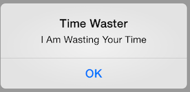
We’ve all seen them. The dialog with the ok button that may as well say I am wasting your time for all the good it provides.

These are a class of dialog that deserves to be burned with fire. They provide absolutely no benefit to the user and contribute nothing but noise.
The iOS human interfaces guidelines on this are quite simple in regards to using alert views like this. The one-paragraph guideline for using them says:
Reserve alerts for delivering essential—and ideally actionable—information. An alert interrupts the user’s experience and requires a tap to dismiss, so it’s important for users to feel that the alert’s message warrants the intrusion.
Then later in the document when it describes alerts, it puts it in more detail.
An alert gives people important information that affects their use of an app or device… It’s best to minimize the number of alerts that your app creates, and make sure that each one offers criticial information and useful choices (emphasis mine). They then go on to detail the times to use dialogs or to use some other mechanism. For the most part, the use of these dialogs is discouraged as they are very intrusive.
