On walled gardens

I recently downloaded an application for doing ‘time since’ tracking. Tracking these stats is not something I would associate with cloud based services – I would anticipate the data being on-device, and not leaving unless you explicitly chose to export it.

The first thing I encounter is a login screen. It asks for an email and password, and if I don’t have an account, it asks to create one; obviously requiring an email and password.

Closed app,

Deleted from device.

I have no way of interacting with the app without an account, as a result I don’t know if it’s good or bad, all I know is that it’s asking for some PII, and I’m not willing to take the chance that it’s trustworthy.

Security – get the facts

This is similar to the slippery slope of drugs and alcohol for addicts – somewhat humorous (from @thegrugq):

“I used to use 1024bit keys, then my friends switched to 2048, I felt I had to as well. Now I’m using 4096. Everyday”

#EncryptionGetTheFacts

The pointless dialog

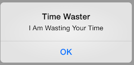
We’ve all seen them. The dialog with the ok button that may as well say I am wasting your time for all the good it provides.

TimeWaster

These are a class of dialog that deserves to be burned with fire. They provide absolutely no benefit to the user and contribute nothing but noise.

The iOS human interfaces guidelines on this are quite simple in regards to using alert views like this. The one-paragraph guideline for using them says:

Reserve alerts for delivering essential—and ideally actionable—information. An alert interrupts the user’s experience and requires a tap to dismiss, so it’s important for users to feel that the alert’s message warrants the intrusion.

Then later in the document when it describes alerts, it puts it in more detail.

An alert gives people important information that affects their use of an app or device… It’s best to minimize the number of alerts that your app creates, and make sure that each one offers criticial information and useful choices (emphasis mine). They then go on to detail the times to use dialogs or to use some other mechanism. For the most part, the use of these dialogs is discouraged as they are very intrusive.

Coders love absurdity

Taken from a Medium post:
Programmers have to worry about things no sane human being ever considers. You drop a “last name” field in your design without thinking about it, but to a coder, there’s a hundred anxieties associated with that:

  • What if the person doesn’t have a last name?
  • What if their last name is expressed as a mathematical equation?
  • What if their last name is longer than 255 characters?
  • What if their last name contains tab characters, multiple paragraphs, non-breaking spaces, emojis, parentheses, commas, single and double quotes?
  • What if their last name changes between the time when they type it in and the time when they submit the form?

To any normal human being, these questions are absurd. To a coder, they are common sense. What this means for you, as a designer, is that you must keep close to your coders, try as much as possible to anticipate the anxieties that will besiege them, and keep them from derailing the experience with utter lunacy.

Some truths about colors…

Taken from a Medium post:
The only things you can communicate with color are:
Any color: this thing has a color.
A different color: this thing is not the same as the other thing.
Gray: this thing is broken.
Red: the designer hates you and wants to make you angry.

Do not be daunted by the enormity of the world’s grief

Quote often attributed to the Talmud, however it seems to be a mashup of quotes. The intent is nice, though.

Do not be daunted by the enormity of the world’s grief. Do justly, now. Love mercy, now. Walk humbly now. You are not obligated to complete the work, but neither are you free to abandon it.

DW on developer vs coder

Dave Winer, a few years ago wrote

To say a developer is a coder would be like saying a composer is a note-writer.

The most important thing is that in the end of the day, it’s creative work that gets done, but writing code is only the mechanical act, it doesn’t capture the art behind it.

PKI / PGP Primer

@JZdziarski: PKI / PGP Primer:🔑 Public Key

🗝 Private Key

📝 Message
📝+🔑 = 🔒✉️ Encrypted

🔒✉️+🗝 = 🔓📝 Decrypted

📝+🗝 = 🔏✉️ Signed

🔏✉️ + 🔑 = 👤 Authenticated