The pointless dialog

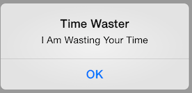
We’ve all seen them. The dialog with the ok button that may as well say I am wasting your time for all the good it provides.

TimeWaster

These are a class of dialog that deserves to be burned with fire. They provide absolutely no benefit to the user and contribute nothing but noise.

The iOS human interfaces guidelines on this are quite simple in regards to using alert views like this. The one-paragraph guideline for using them says:

Reserve alerts for delivering essential—and ideally actionable—information. An alert interrupts the user’s experience and requires a tap to dismiss, so it’s important for users to feel that the alert’s message warrants the intrusion.

Then later in the document when it describes alerts, it puts it in more detail.

An alert gives people important information that affects their use of an app or device… It’s best to minimize the number of alerts that your app creates, and make sure that each one offers criticial information and useful choices (emphasis mine). They then go on to detail the times to use dialogs or to use some other mechanism. For the most part, the use of these dialogs is discouraged as they are very intrusive.

What a pointless ‘auto updater’

Another morning, another Adobe Flash update.

Big ass dialog telling me that I have an update which links me to their website where I have to uncheck the dumb-ass add-on options for (depending on the week) McAfee and the Google toolbar.

Several months ago Adobe were pushing/advertising their auto-updating technology. They were pretty much saying ‘completely automated updates‘. To me it seems more like manual updating. You’re wasting my time with the prompts, the dialogs, the small download which subsequently downloads the update (each one is tied to the version of flash you’re downloading so what’s the damned point in having a stub downloader for each version).

If you want to see a proper auto-updater you should look to google. It downloads updates silently in the background, applies them (as much as possible) in the background and if you need to restart your browser it mentions this in a prompt. The downloads are tiny, caused by their use of their differential compression algorithm which keeps the updates small to the point of being downloadable in the background while not interfering with your normal use of the system. At the same time they’re not pushing a bunch of extra third-party software on you.

Duelling birthdays

It’s definite, and I think the culprit is my calendars on windows live… Or maybe it’s the calendars on google, but it’s definitely not the calendar on my phone, which is freaking bizarre.
I like to maintain birthday calendar entries for my friends and family. I’ve been doing this since I got a palm PDA, and it had been reasonably effective at maintaining this information between my one PDA and my one single calendar on my PC. Several years ago I signed up for a Plaxo, and for a brief time all my disparate calendars got synchronised with one another. Then I started to notice that birthdays ended up off by a day. Regularly they were off by a day, and it just seemed to happen as if ‘by magic’ — one day the sync would happen and the day would be off. I never noticed it until well after the change happened.
Phones come and go, but the plethora of services I use has only got worse. I currently have 3 primary address books – Windows Live, Google and iCloud. Far and away, my most preferred is iCloud, but that address book will not migrate to any android or windows mobile devices I have. The reason for this is that it seems to support more numbers per contact than all the others, supports separating out all the mechanisms for contacting them like IM and Skype handles. The others do some insane form of remapping of the contact number, yielding multiple conflicting types of contact detail all mapping to the same piece of information, e.g. I will end up with ‘iPhone’ and ‘mobile’ entries for someone all mapping to the same phone number, complicating the contact information no-end.
Then there’s the birthday problem. I store a birthday in the phone, and for the contact on Windows live it seems to drift by a day, I don’t know if this is cumulative, but it really is nutso — there is no reason for a date to drift away like that; I mean let’s be honest about this, they should be stored recording the day and month, and optionally the year (truth be told, we don’t want to all reveal how ageing we are these days).
So on my last examination of contact information for my niece, it turns out that it had drifted her birthday by a day for one address book, but kept it the same for all the others… It is seriously making me consider dropping the other address books for a consistent one, but the my address book on non iCloud supporting devices is a bit of a deal breaker, which is why I try to keep them in sync. Maybe I’ll try a wipe and restart again; I’m sure that I’ll lose nothing in the process… and if you believe that, I have this wonderful bridge I’d like to sell you.
Raw data

Most of the times you experience data it has been massaged, interpreted and analyzed. This is a side effect of having so much data to process, and also having an agenda.
We see papers regularly, with attached shiny graphs and tables. ehmmm, yeah, nice shiny graphs; pretty distracting, but not actually revealing the underlying information.
What I want is a link under every one of those damned graphs linking to the raw data.
Not much to ask for – raw unfiltered research data. I mean really??